Friday, October 3, 2008
.::8::. Bloggity Blogg Blog
so, after a certain amount of repetition, certain tags stay with you, i.e., <*a href="">link. and i imagine some coding will eventually be second nature. but in general how many details should i try to be committing to memory? syntax is crucial, but for some of the more nuanced/less common codes...is it ok to rely on references? memory doesn't/can't be our only resource right?

Saturday, September 27, 2008
.::5::. Grrr
i'm either tired or stupid or both, and maybe it's my blog settings, but i wanna be able to see my whole table in post 4. i'm missing half a rothko and an awesome pollock. oy. tomorrow.
Friday, September 26, 2008
.::4::. Testing
ok.
i just want to see something.
i just want to see something.
.::experiment::.
| my Artists | VanGogh | Picasso | Rothko | Pollock |
| my *Painti | Crows Over Wheatfield | Girl Before a Mirror | Ochre and Red on Red | Full Fathom Five |
| my pic.s |  |  |  | 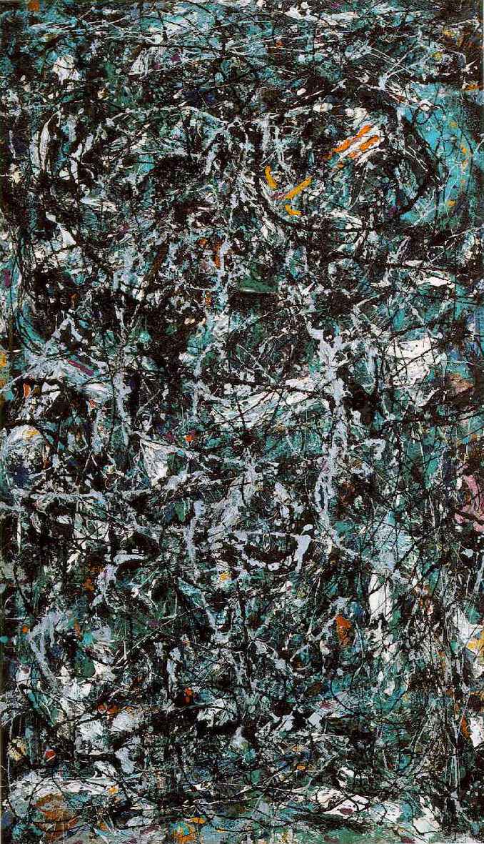 |
.::3::. Komodo
hey mac people
apple's downloads site offers another text editor -komodo-. i've been playing around with it, so far i like it a lot. just fyi, in case text wrangler doesn't sit so well with your aesthetic predisposition.
also, i was going to do a screen shot, but blogger doesn't support .tiff extensions, and grab automatically defaults to that kinda of file. any way around that, or some sort of multi-step reformatting method that works like a charm? in writing this, i realized i could just save the image apple used to show komodo instead of showing my browser window opened to it. but that doesn't solve the problem so much as give me a viable option.
Saturday, September 20, 2008
.::2::. Wire Frame Fun

My first wire frame & why:
- depending on the logo design, i wanted it to anchor the shop name on both sides
- i hate when you have to click to get company contact info
- unless there's a really big image on the left for design purposes, right panel navigation menus seem counter-intuitive to me
- i tried to keep the most important info closer to the top [above the fold]
- wanted to keep page relatively simple, not overloaded with information; so i wanted a general "animals" link dropped down to a second level navigation with list of specific animal links
- tried to leave room for ads for the client to feature sales/new products but not front and center
Subscribe to:
Posts (Atom)

